
Milkman
Client
Milkman
Year
2025
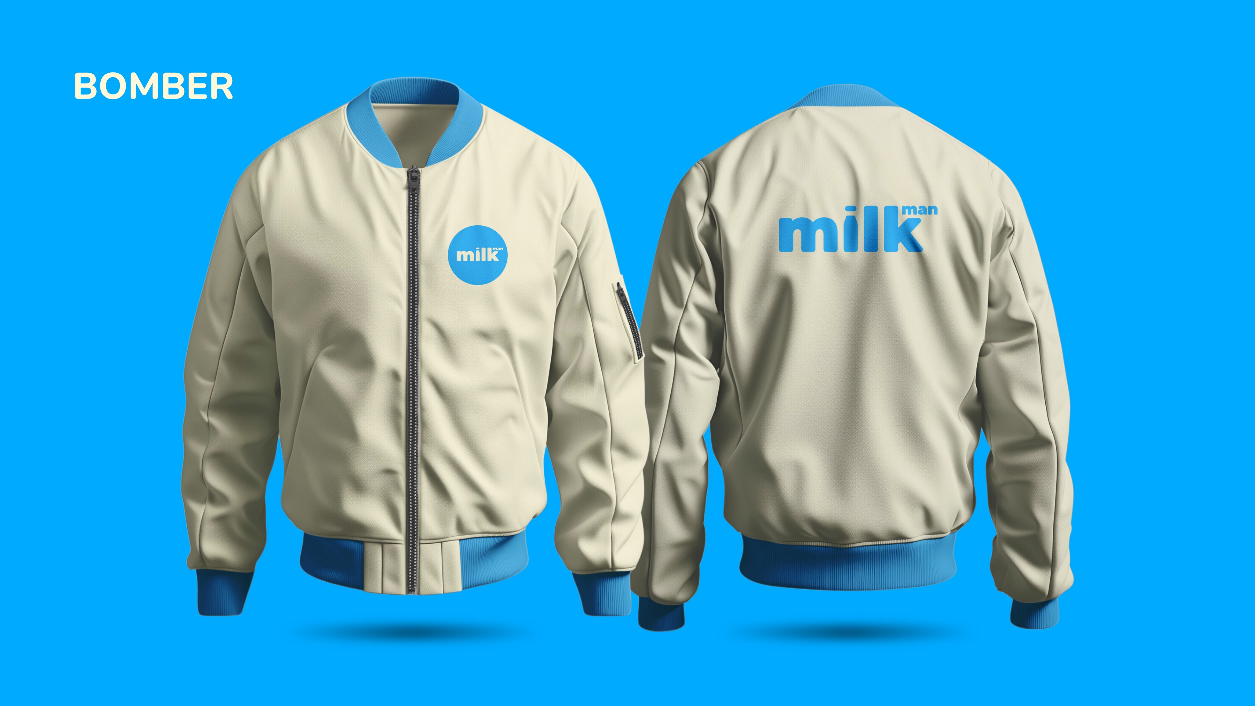
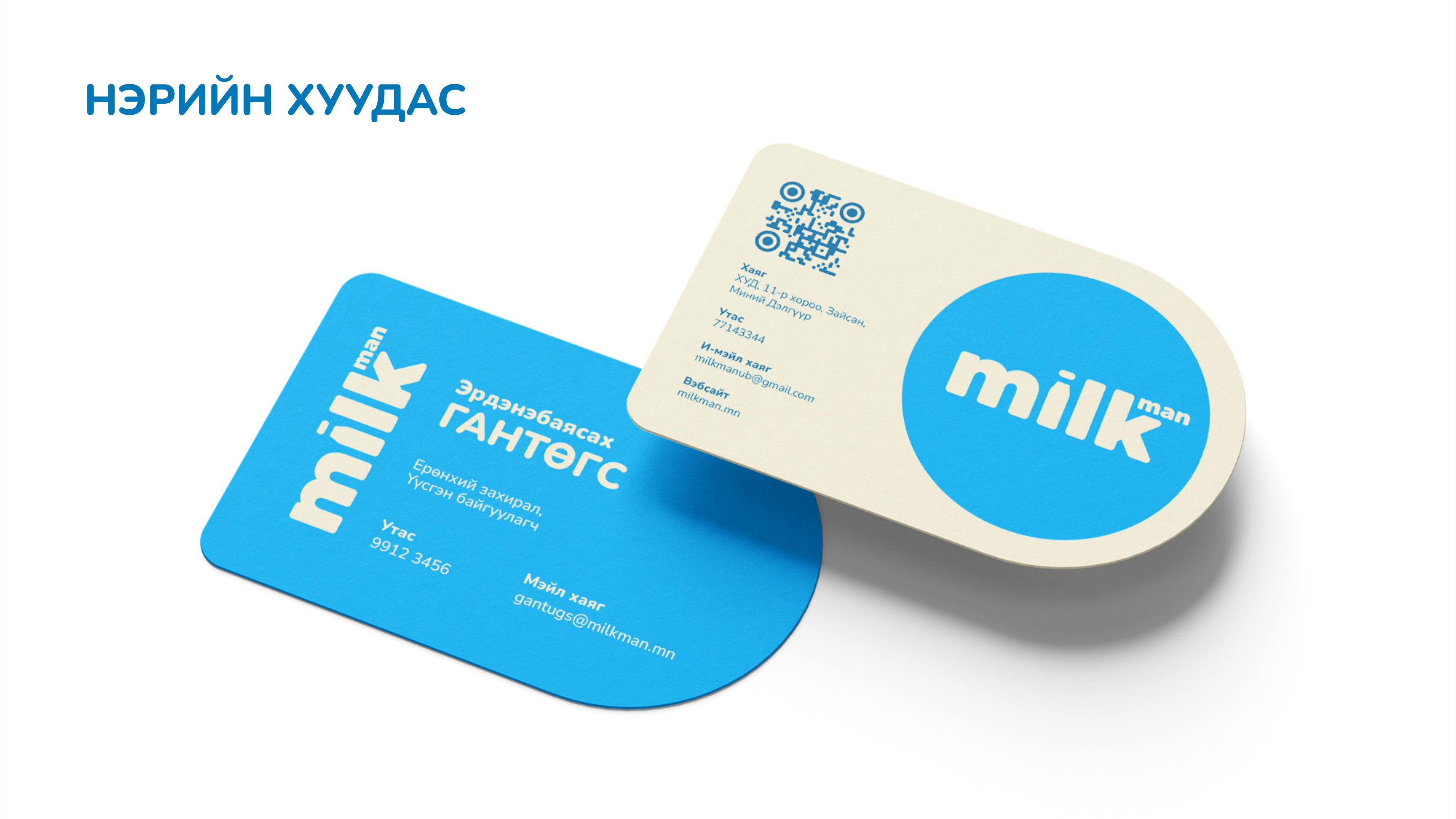
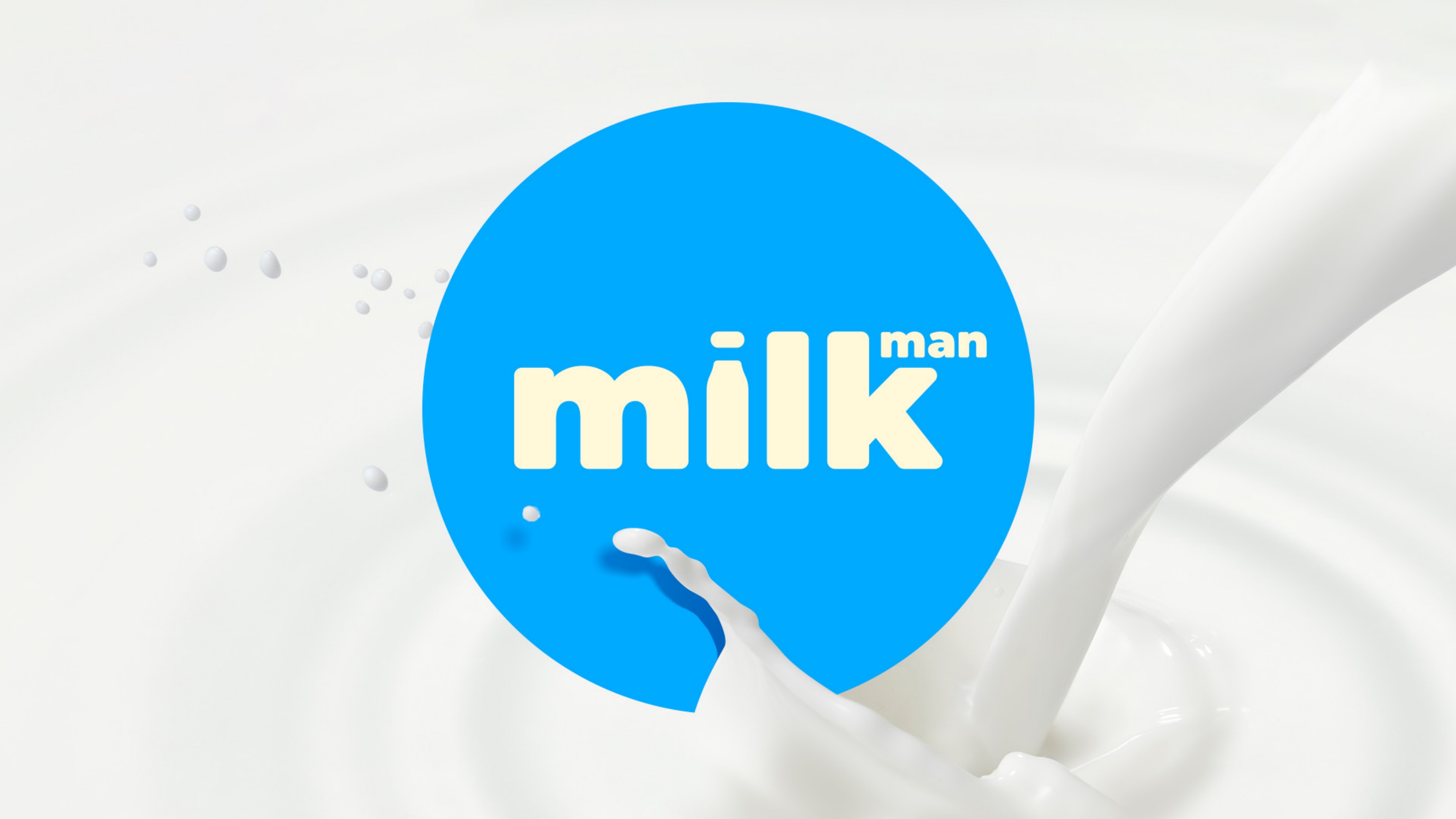
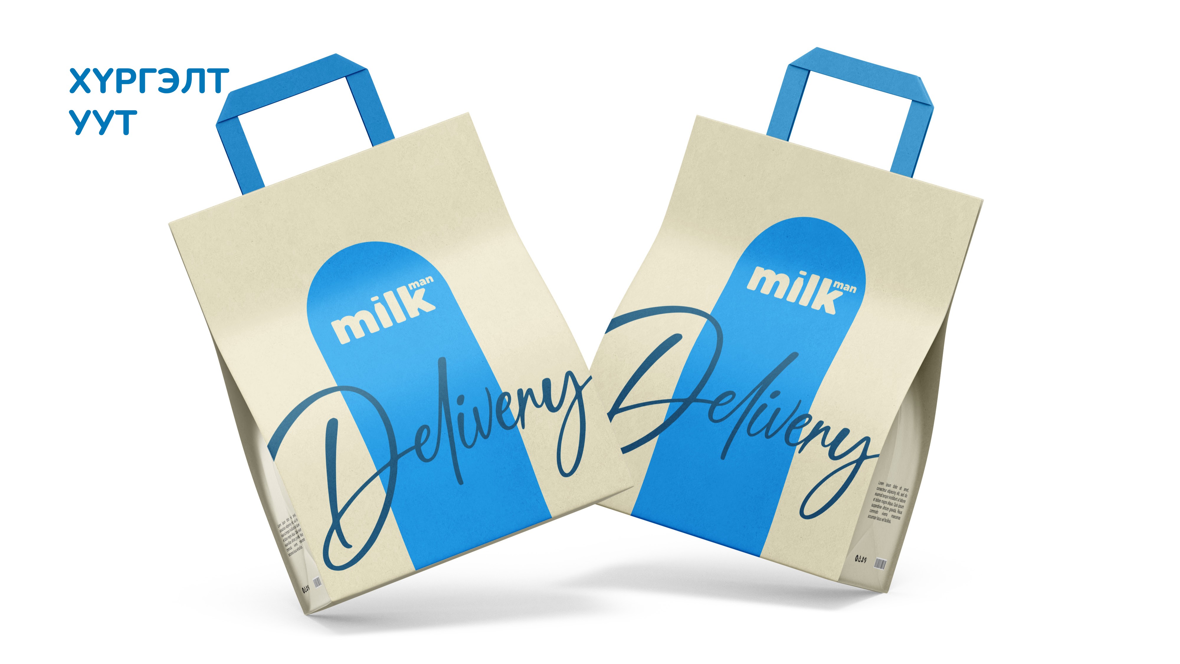

Mongolian dairy is a category built on tradition, and most brands look the part: heavy, nostalgic and interchangeable. Milkman set out to renew traditional dairy with modern production standards and make freshness its core promise. The brand needed an identity as clean and fresh as the product itself.
A friendly circle holding a rounded milk wordmark, with the dot of the i shaped like a milk bottle. Milkman Blue stands for freshness, purity and trust, while a soft cream yellow brings the warmth of fresh cream. One color pair, one rounded typeface, one instantly likable mark.
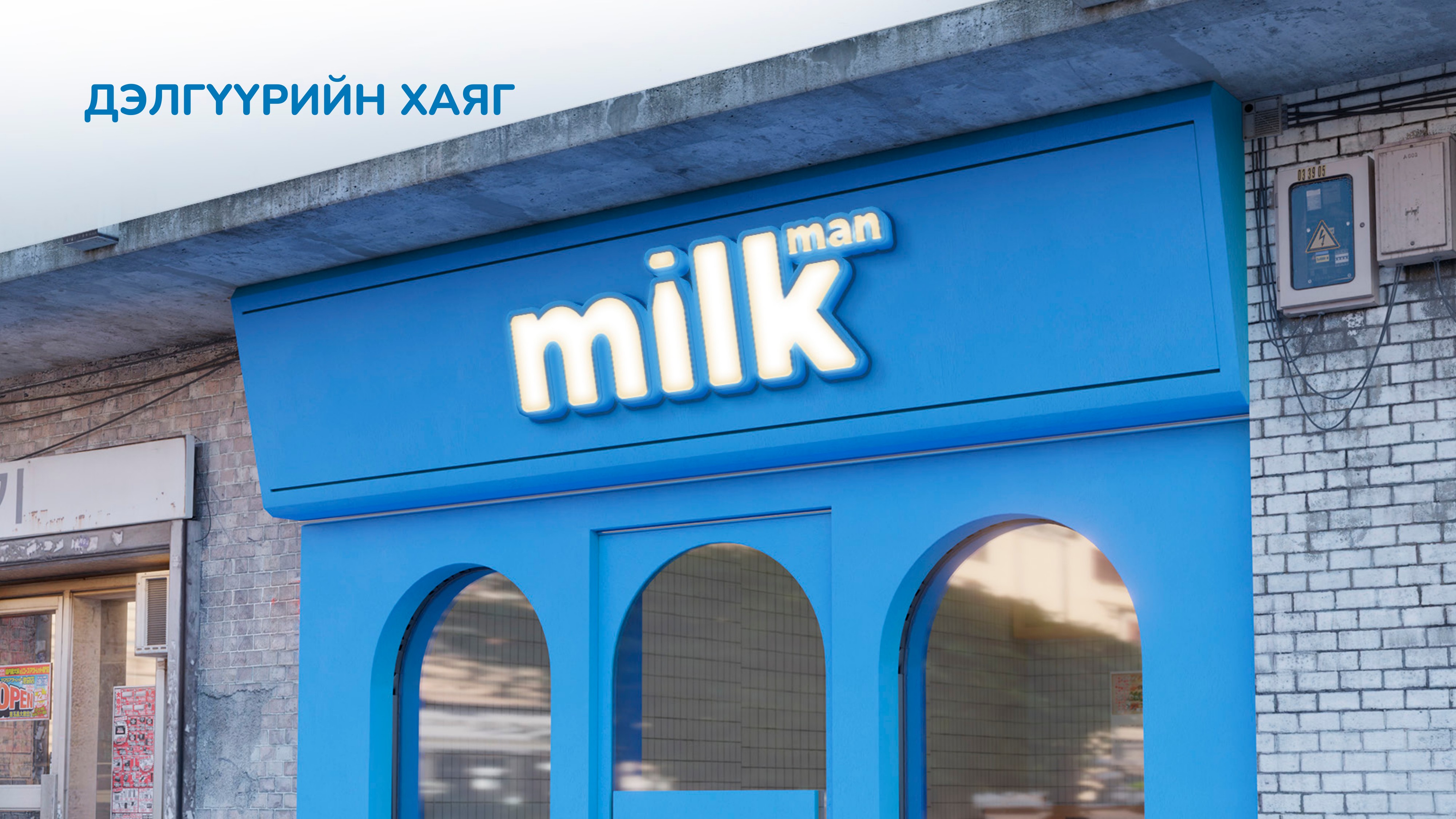
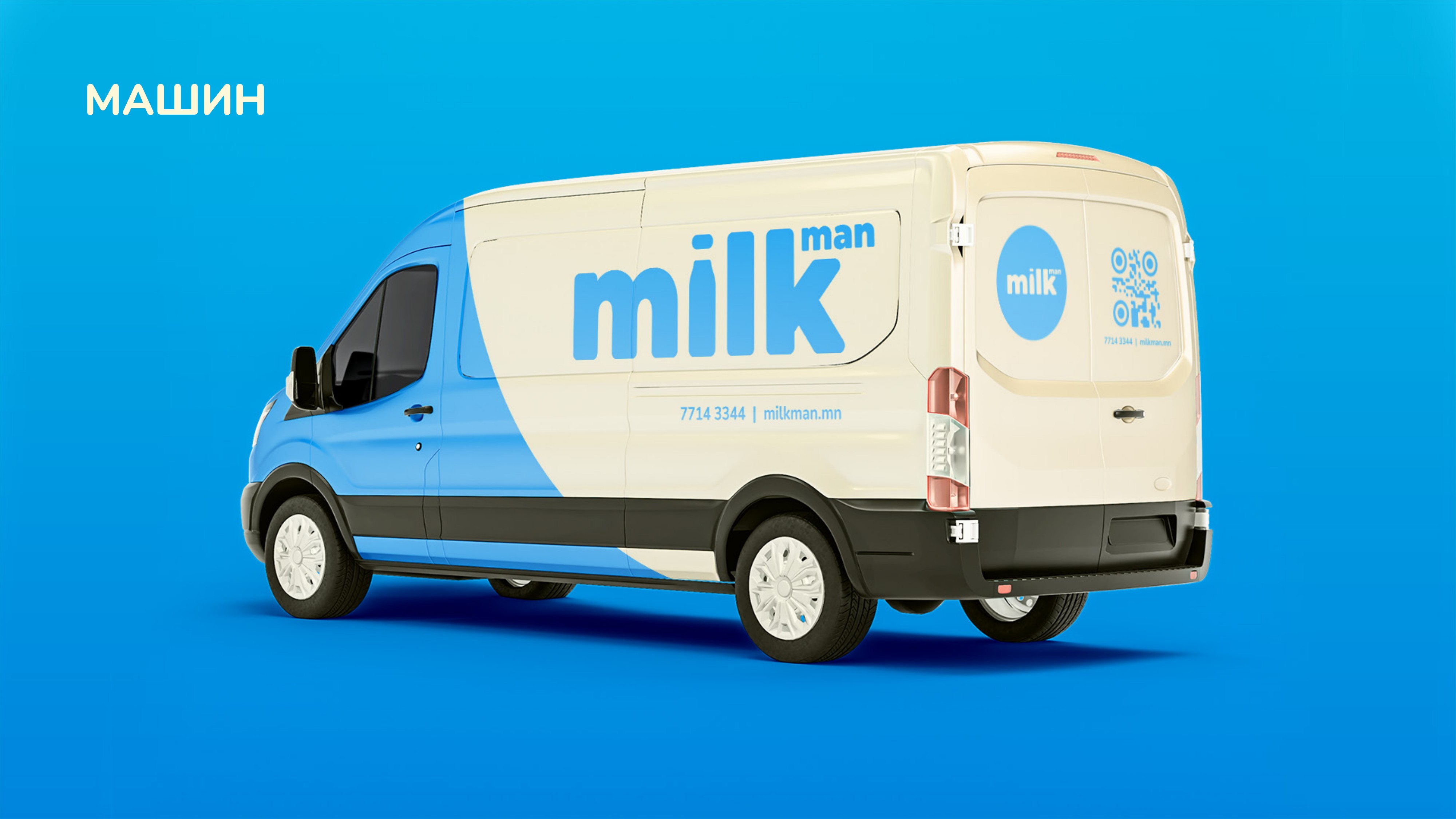
The identity runs on a tight system: the logo with clear space rules, a blue and cream palette with supporting tones, and the Nunito family covering every level of text. It rolls out across social templates, photography, product packaging, delivery bags, uniforms, a vehicle wrap, storefront and outdoor signage, and even a team bomber jacket.
A dairy brand that feels fresh from every angle, from the shelf to the delivery van. Milkman now has a coherent look that any material can follow, and a mark people remember after seeing it once.
.svg)