
Mobicom 30th Anniversary
Client
Mobicom
Year
2026
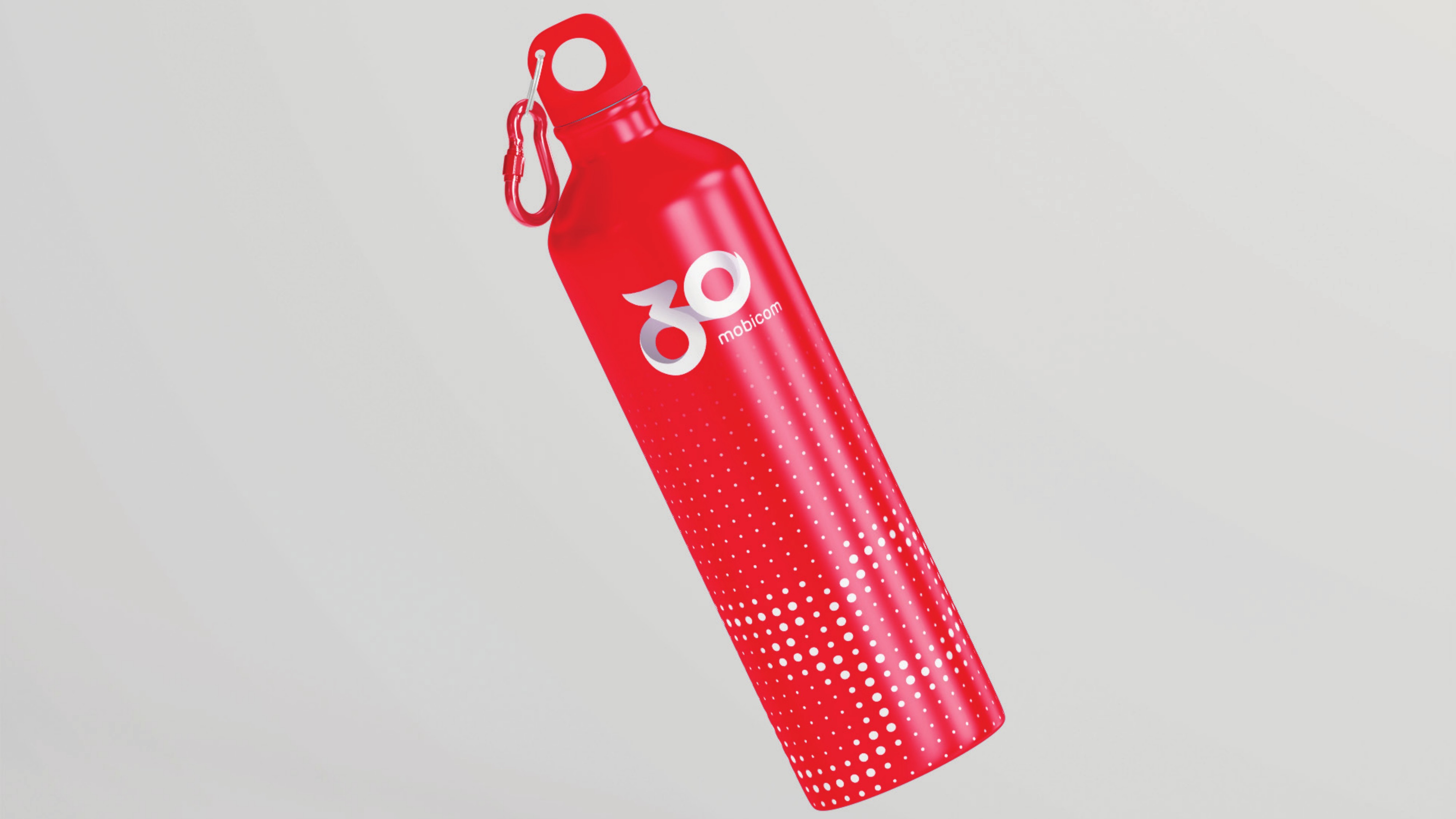
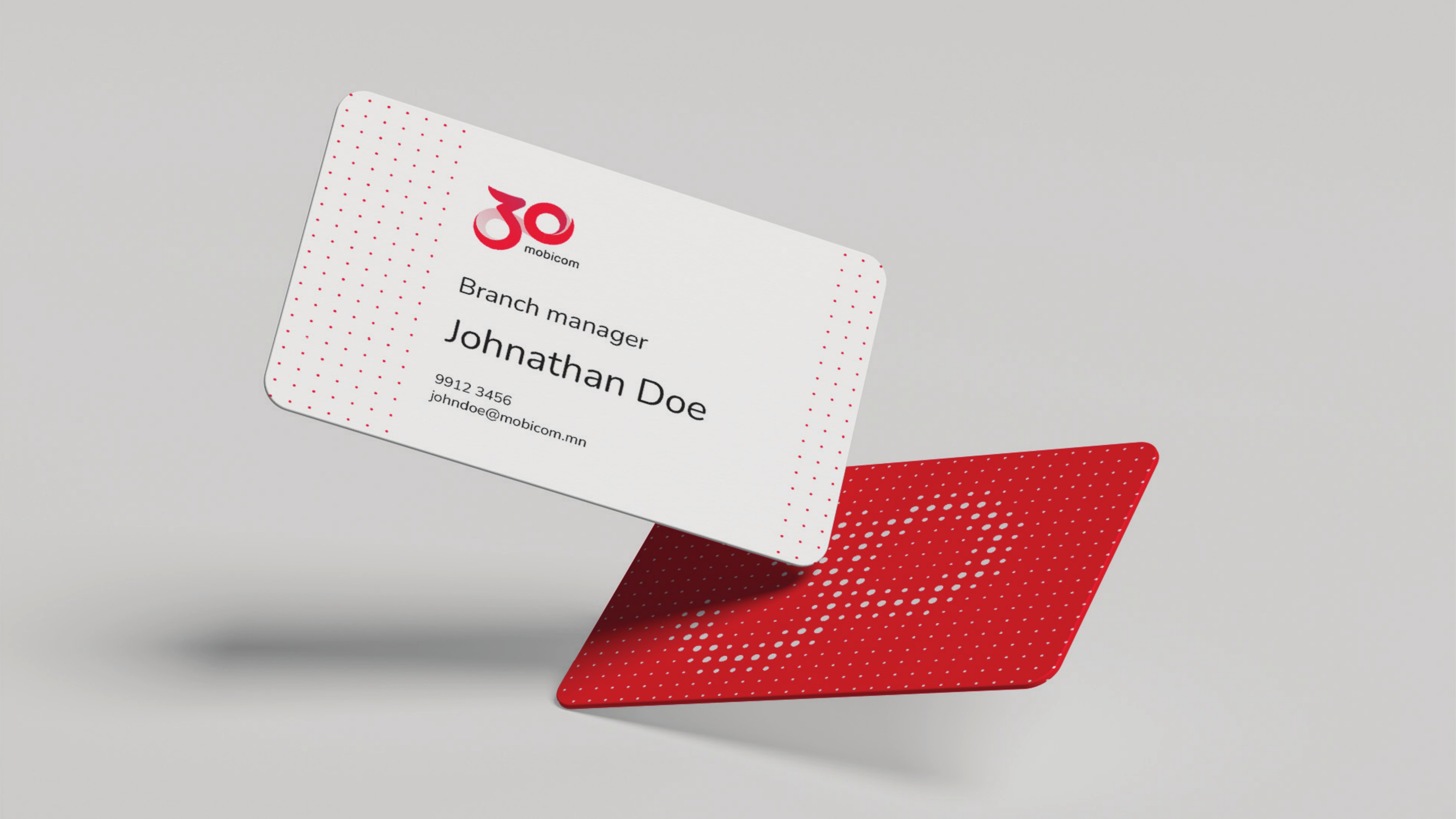
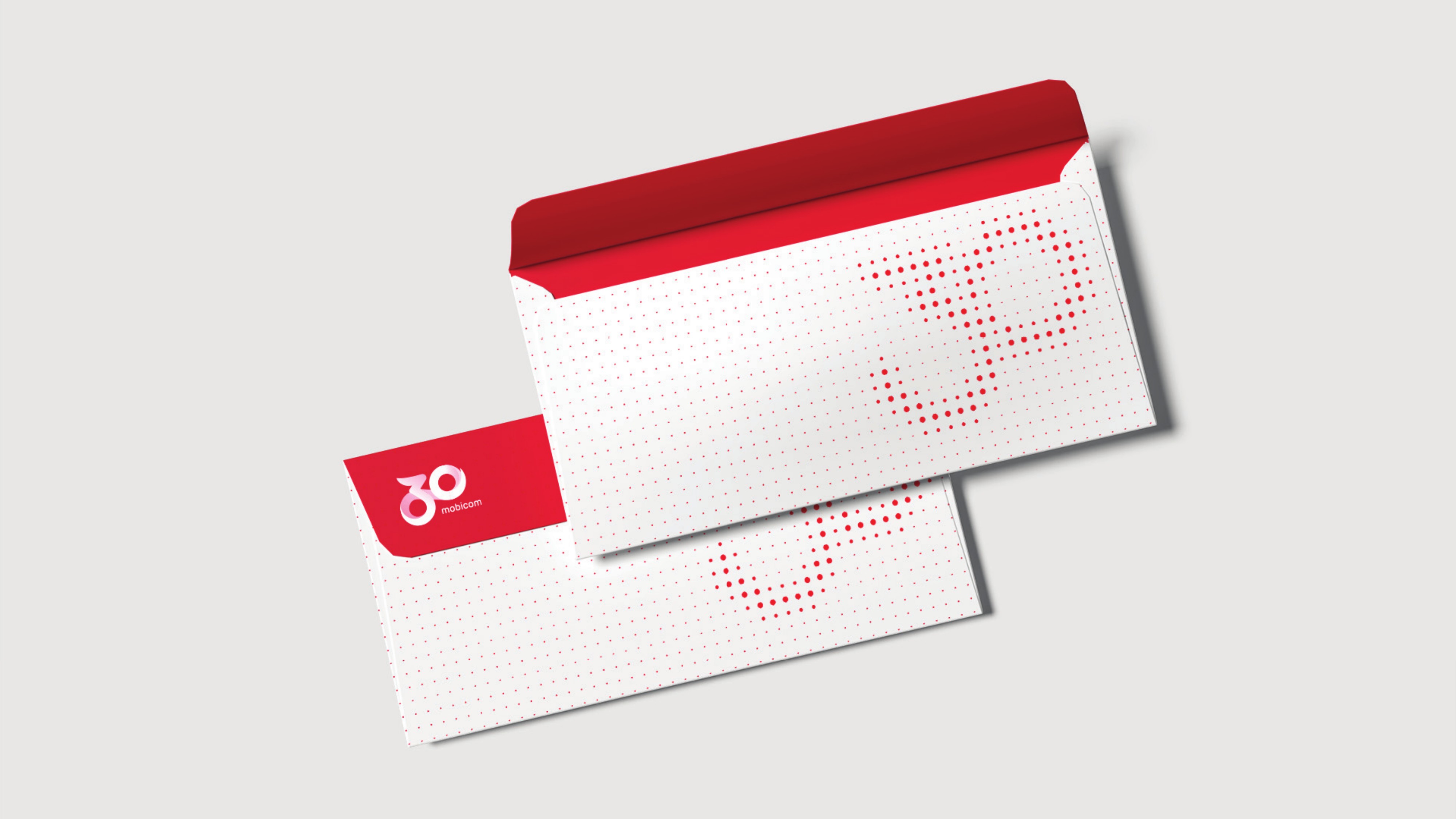

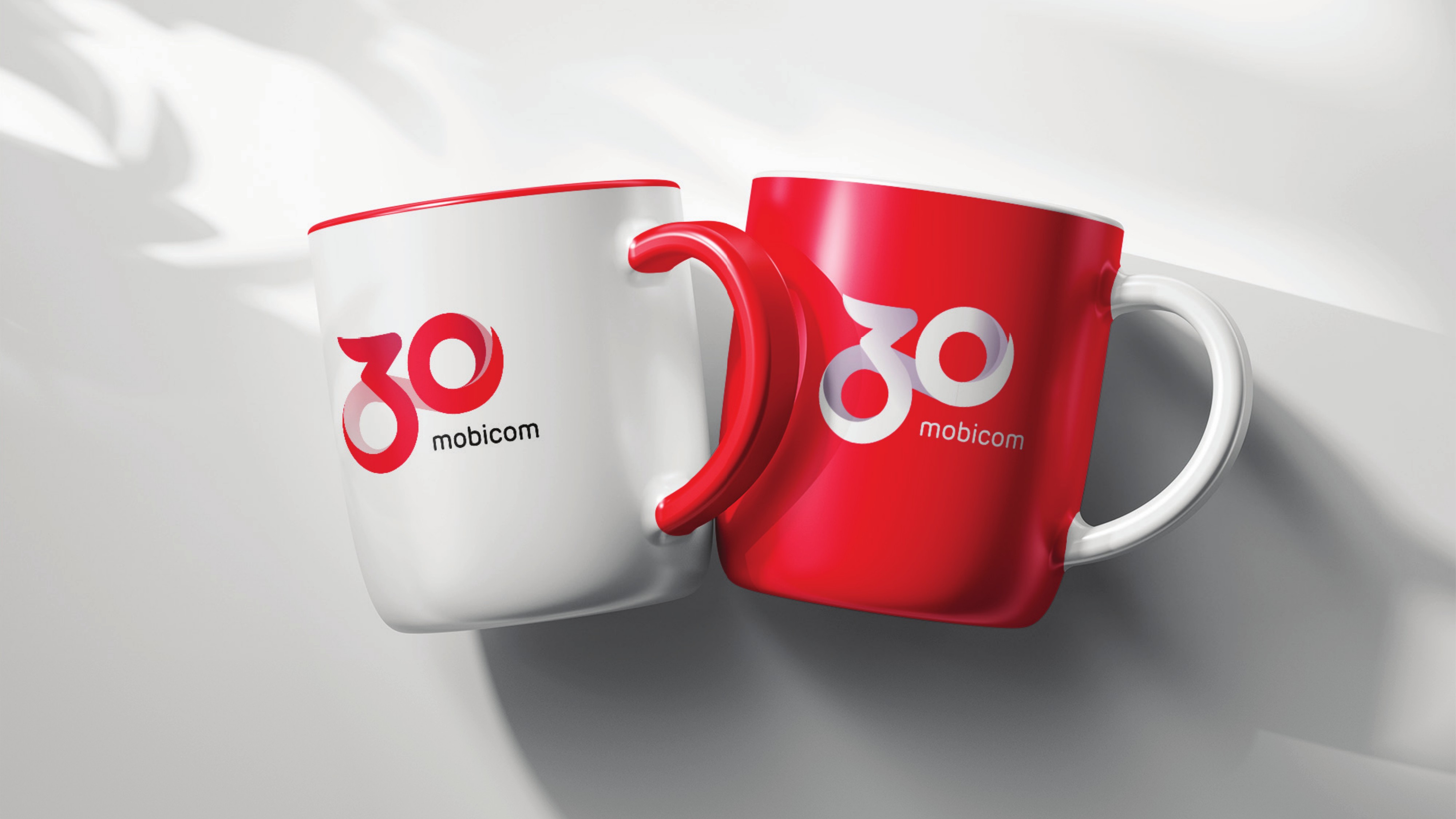
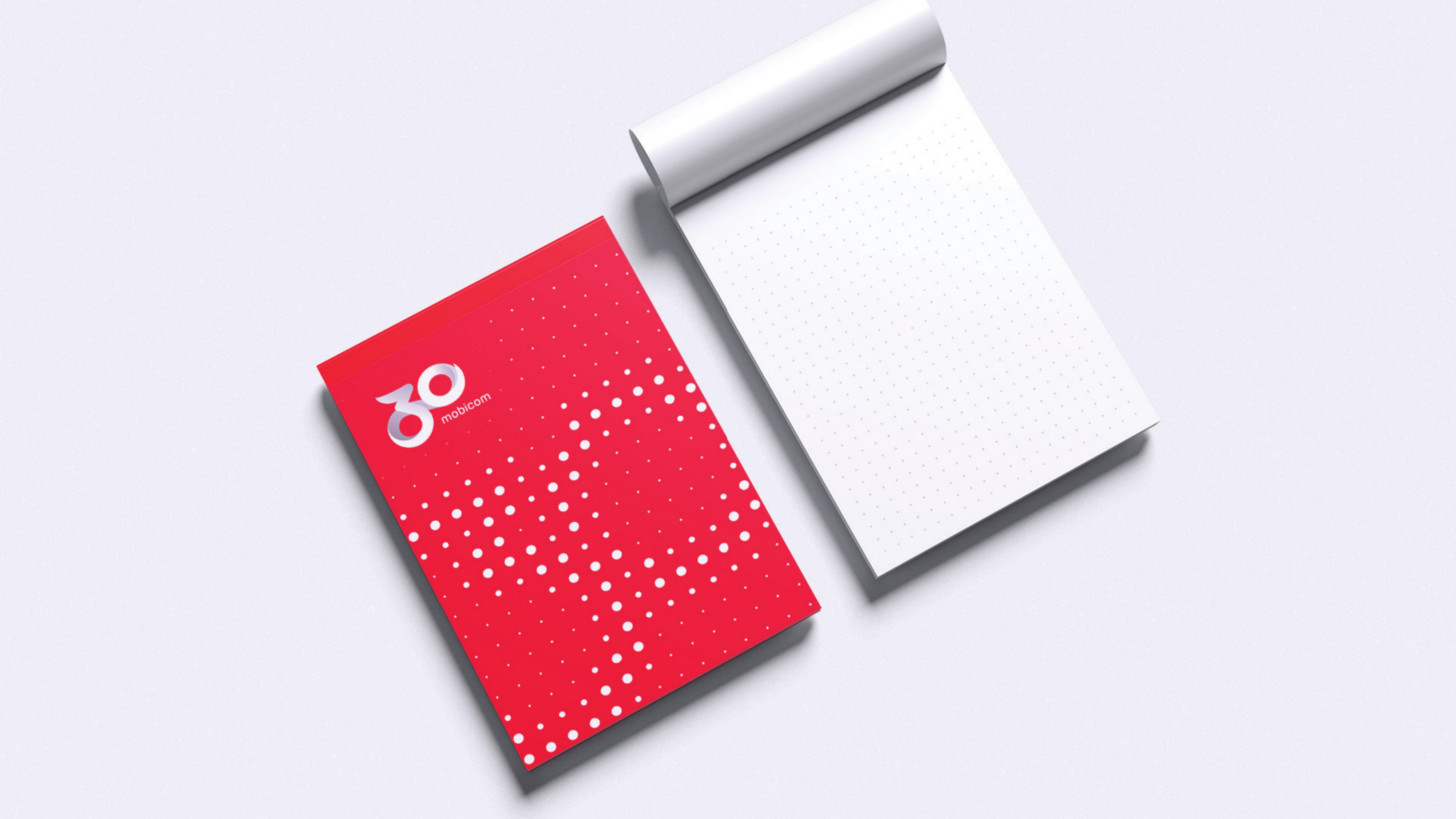
Mongolia's first mobile operator was turning 30. The anniversary needed an identity of its own, one that honors three decades of firsts while pointing at what Mobicom is becoming, a technology company rather than just a telco. And it had to hold up everywhere, from a business card to a stage screen.
A 30 drawn in one continuous motion from the Mobicom logo itself. The stroke flows from one figure into the next without stopping, a symbol of constant change and the company's move from telco to techco. Three ideas anchor the identity: technology company, cellular pioneer, and a mark that keeps evolving.
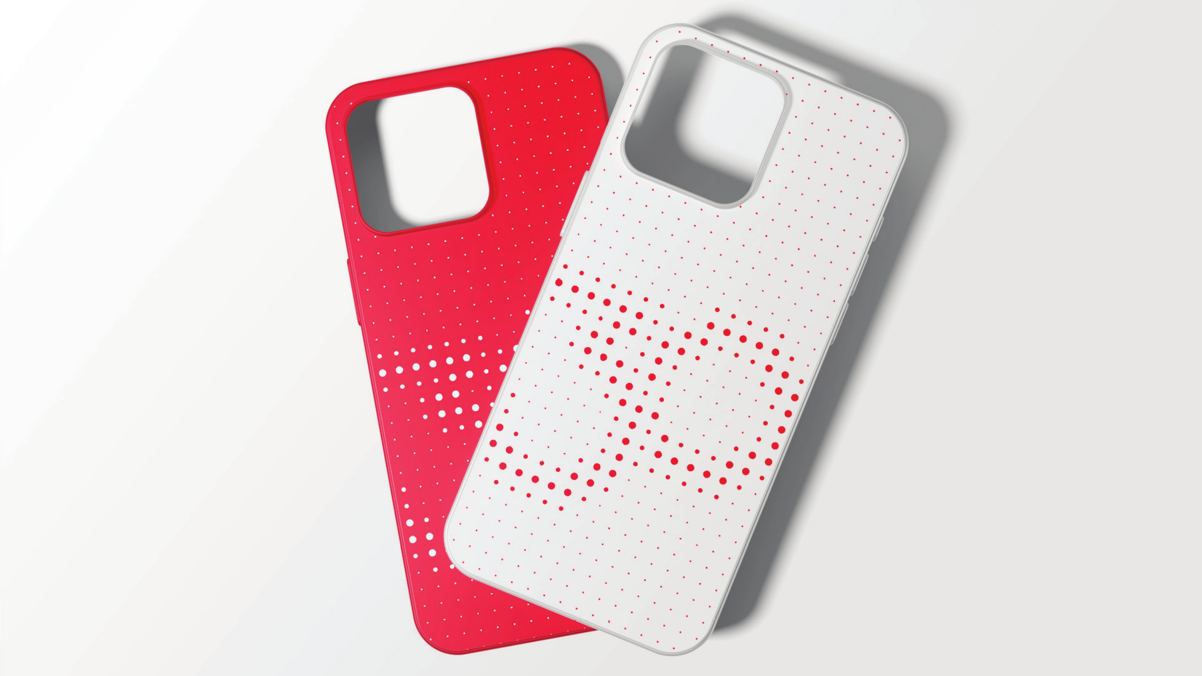
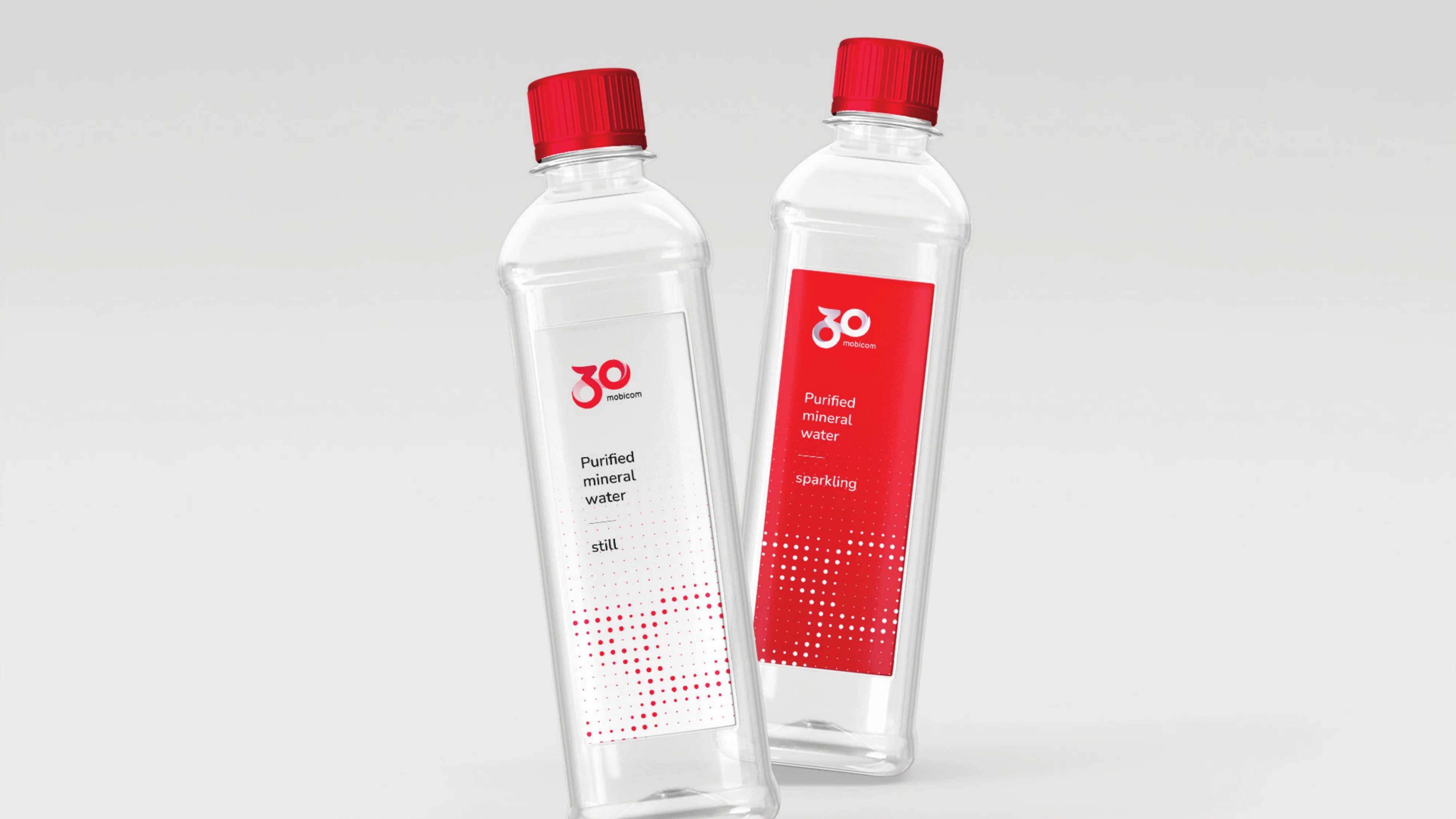
A complete guideline covering the full system: color, white and flat logo versions with clear rules for every background, a red-led color and gradient palette, a three-font type system pairing Nunito with Inter and Caveat, three tiers of photography direction from premium to lifestyle, and a halftone dot pattern built from the logo itself. The system was applied across stationery, merchandise, video formats and digital layouts.
Mobicom's 30th anniversary now speaks one visual language across every channel. Any designer or partner can pick up the guide and produce on-brand material without guesswork, which is exactly what a thirty year old brand needs during a year of celebration.
.svg)